Eternal Ascent Art Breakdown - My Best Render?
Creating a 3D animation in Blender in 30 days
09.03.2024 - 12:20I participated in the Eternal Ascent Community Render Challenge by Clinton Jones. Like previous challenges, everybody starts with the same basic template file and has to create their animation from there. All final submissions are combined into an epic montage like this one from the previous challenge. For this event, the template was a figure slowly walking upstairs.
This was my 6th participation already and due to a mix of no active freelancing projects and procrastinating writing texts for my new website, this has been the challenge I spent the most time on, leading to probably my best result so far.
Idea
Even though I like worldbuilding and creating environments more, the main focus is usually on the character, and one of the tips when trying to come up with an idea for a render is to think about why the figure is walking up the stairs.
The slower pace of the character ascending the stairs reminded me of an older gentleman. But why would he walk up the stairs? Many older people care a lot about the tidiness of their homes and gardens, so he would walk up to clean up a mess.
My idea for how the mess was created was a raven. The raven would have knocked over and destroyed a flower pot and is looking for a worm in the dirt. It would have been cool if the destruction of the flower pot happened at the beginning of the render, but then the timeline wouldn’t make sense. Why would the man already be walking up the stairs with a broom in his hand, if the destruction hasn’t happened yet?
Character
After struggling with characters in previous challenges, I vowed that I would do a robot in the next one. Robots are hard-surface-modeled and easy to weight paint because everything has either a weight of zero or one. However, my idea required an old man character. I considered trying to create some sort of old robot but decided to attempt another human instead. I watched some sculpting tutorials and for the first time, I felt that I was getting decent results. A big advantage of the template scene was that the character faced away from the camera, which meant that I didn’t need to add any details to the face.
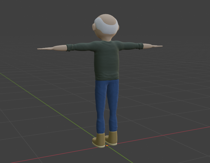
The template scene also included motion tracking data and with the Rokoko animation retargeting plugin for Blender, copying the animation onto my character was easy. However, this is also where the problems of my character became apparent. The automatic weight painting was atrocious and parts of the model were very glitchy. I had to spend a lot of time manually weight painting the affected areas.
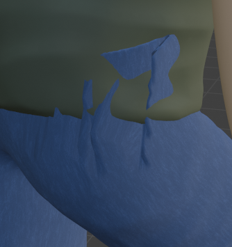
I had joined the extremely high-poly sculpted model and then decimated away most of the vertices, which had left the topology of the model in a horrible state. I briefly looked into retopology workflows, but they seemed like a lot of time-consuming work and not like something that I could learn in a day during the challenge.
However, this character model has been the best I have created so far and I’d like to try to create a proper character model with a face and good topology when I find some free time.
Raven
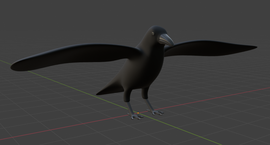
I created the raven model with subdivision modeling and I like how it turned out. The rigging and weight painting of the model weren’t too bad either. However, it had one big problem: It couldn’t fold in its wings properly, which made the animation a lot more difficult. In the end, I scaled down the wings to 0.1 while the raven is picking at the worm, and then scaled them back up to their original size over two frames when he “unfolds” his wings. This trick wouldn’t have worked on most models, but luckily, the raven is completely black and fairly small, so you cannot see the weird-looking wings. The rest of the animation isn’t great either because I struggle with animating living creatures, but it’s good enough to convey the story and doesn’t detract from the overall render too much.
Environment
Building the rest of the environment was a lot of fun and most of the models were easy to create. The biggest hurdle was the car model. The smooth and flowing form of the car body is much more reminiscent of organic models than hard-surface ones, which required a lot of tweaking to get a good-looking shape.
My main inspiration for the environment was less busy streets in cities like New York City, Boston, or Washington with older townhouses, maybe even set in the 80s instead of today. I think the overall vibe of my street turned out close to what I was going for and I’m very happy with it.
As part of the challenge, EmberGen was freely available to all participants. EmberGen is a real-time simulation program for fluids, fire, explosions, smoke, and more, and I wanted to use the opportunity and try it out. I have to say, it’s a great program. The node-based workflow was very intuitive and I was able to make some smoke effects for my scene. I added one of those steam vents you can sometimes see in the streets of New York and I even figured out how to import a manhole cover as a collider and made some smoke rising from the manhole covers for fun. Sadly, it’s way too expensive for hobbyist artists like myself.
Materials, Lighting, and Style
Creating good-looking photorealistic materials is either time-consuming or requires downloading external assets, which I do not like. Therefore I wanted to go for a much more stylized, maybe even cartoonish look with mostly solid colors (also considering that cartoon characters are easier to create than realistic ones). Originally, I wanted to go a lot brighter and more saturated but with the sunset and autumn colors, it ended up a bit moodier.
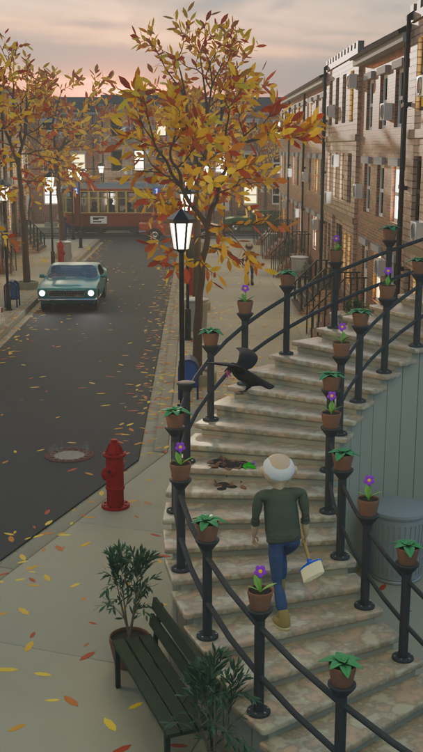
Most of the light comes from the streetlights and windows but the sun still hits some of the building tops on the right. I also employed some fake lighting and placed some area lights over the stairs because they were quite a bit darker than the rest of the scene.
The final look of the scene before color grading:
Color Grading & Post Processing
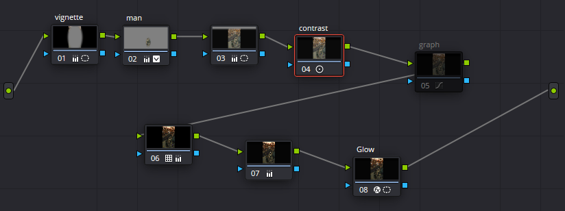
The final step of every render is color grading and post processing. This render had the most involved color grading I have ever done. I went through different LUTs that DaVinci Resolve provides to find a rough look that I liked, which ended up being quite dark. I then added multiple different masks for different areas of the scene to refine the look like adding more contrast and highlights to the character and increasing the brightness of the scene compared to the sky. I also added film grain and some bloom.
While I initially liked the darker and moodier feel, after looking at the final result too many times, I think I may have gone a bit too far and it could have been a bit lighter.
Color grading and post processing node setup in DaVinci Resolve:
External Assets
Before concluding, I want to talk about external assets. Downloading and using third-party assets is allowed and I would guess that almost everybody uses them. However, this is one aspect of these challenges - and 3D art in general - that I do not like.
For me, using external assets feels like cheating. Is it still my art if the majority of the assets are downloaded? What about AI tools like Sora? Will some people argue in future challenges that prompt engineering is a skill too?
Creating art is personal and these render challenges should be a measurement of your current skill level. I’m very bad at character modeling and rigging, but if I just downloaded a character from Mixamo every time, how would I ever improve?
Additionally, a lot of high-quality assets are expensive and it almost becomes a pay-to-win game to reach the top 100. When you see some of the amazing entries at the top, you never know how much has been imported vs self-created.
I’m not against all external assets. For example, I have used two external assets myself: The HDRI from Poly Haven and a walking animation from Mixamo, but they are only used in the background and available for free.
I wish there was a second version of the challenge where you had to create everything yourself during the challenge, a bit like the Compo variant of the Ludum Dare game jam.
Overall
Overall, I’m very happy with my submission for this render challenge. My chances to get into the top 100 are still very slim, but it might be the best render I have submitted to one of these challenges so far. There are still countless things I’d like to improve and I could spend a few months going back and forth between different options and still not be able to decide what looks the best.
Anyway, here is my final render:
https://youtube.com/shorts/rnOSZIoIW7o?si=Ff0QcKjypvO00aOy - (Apprently, my embed code doesn't work for YouTube shorts and there isn't even an embed option in the shorts share button?)
And here is a short art breakdown video. I rendered most of my still test renders on frame 60, so you can see the progress seamlessly and I think it looks quite cool:
https://youtube.com/shorts/XV3PI20-Lrc?si=1tCWQ3HchZ9HGJ78
by Christian - 09.03.2024 - 12:20
Comments
555
by pHqghUme - 25.07.2024 - 11:45
555
by pHqghUme - 25.07.2024 - 11:45
555
by pHqghUme - 25.07.2024 - 11:45
555
by -1 OR 2+670-670-1=0+0+0+1 -- - 25.07.2024 - 11:45
555
by -1 OR 2+606-606-1=0+0+0+1 - 25.07.2024 - 11:45
555
by -1' OR 2+850-850-1=0+0+0+1 -- - 25.07.2024 - 11:45
555
by -1' OR 2+890-890-1=0+0+0+1 or 'A - 25.07.2024 - 11:45
555
by -1" OR 2+255-255-1=0+0+0+1 - 25.07.2024 - 11:45
555
by if(now()=sysdate(),sleep(15),0) - 25.07.2024 - 11:45
555
by pHqghUme0'XOR(if(now()=sysdate() - 25.07.2024 - 11:45
 pingpoli.de


