GameDev 2019 Week 8: UI
Debuff Particles, UI
24.02.2019 - 12:40Monday 18.02
At the end of last week I rushed a bit to add the new fire particle texture and the flame burst effect into the game. So there were some issues with the particle editor that had to be fixed. And I also added a circular spawn option to the partical effects, so the flame burst effect now expands into a circle rather than a square. I also decreased the size and number of the particles to make the effect a little more subtle.
Tuesday 19.02
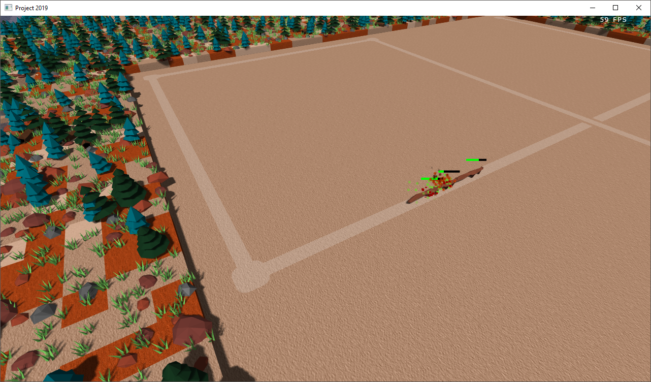
Started the day by making the camera move to the area of the player when the game loads instead of akwardly looking at 0,0,0, which is somewhere in the water. Now the game also uses the squirrel and the bird model for normal and flying mobs, which is a significant improvement over flying squirrels or walking birds. But then the day shifted to particles once more. I wanted to add particle effects to the mobs when they are debuffed, e.g. a poison trail. Therefore I once again had to add a few features to the particle engine: Emitters can now be toggled on and off and can be removed on the fly. If the effect was using a color texture, every instance was creating its own texture, e.g. if there were 20 poisoned mobs, there would have been 20 green textures, so I fixed it and they now share the same texture. I also added a spherical spawning volume for the emitters. After updating the particle editor with all the new features I created a poison trail particle effect and added it into the game.
Wednesday 20.02
It has been a slower day, just worked on particle effects for bleeding and burning as well as some changes to the poisoned one and addem them into the game.

Thursday 21.02
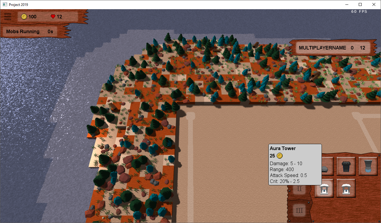
Spend a lot of time experimenting with possible ui designs and trying different textures for the ui. In the end landed on a wooden style which in my opinion fits with the overall theme, even though there may be some towers or even maps with a more modern or even futuristic theme, the majority is going to be more in an ancient, medieval or fantasy style and therefore wood works for it.
Friday 22.02
Created a lot of the textures for the ui, including the building interface background, the building buttons and the multiplayer stats. I also added a feature to my menu library to use preloaded textures for the menu elements to improve the loading time of the game.
Saturday 23.02
When creating the ui for the building interface I also created the buttons for the different building groups or categories, because in the long run having only 9 slots for building buttons will not be enough. So today I added the group of the building to the blueprint files and implemented the functionality of the group buttons so only show the buildings in their group, e.g. the first group could be general purpose towers, the second anti air towers and the last one could be for traps. Then I worked on a new hover component for my menu lib to have greater flexibility in showing the building details when hovering over the buttons. Before they were just listing the price and the damage, now they include most of the stats of the tower and can be customized with images like the gold icon and include different fonts. There is still some work to be done here though, the hover popups need to include the towers effects like on hit effects and auras. Finally, I implemented crits, the stats - crit chance and crit power - were in the game from the beginning but never did anything, but new they do.

by Christian - 24.02.2019 - 12:40
 pingpoli.de


