GameDev 53: Challengers
Starting Characters, Blueprint Changes
07.06.2020 - 20:46Ever since I added the roguelike elements to my game I wanted to have multiple starting characters with different effects. But other features had higher priorities and the character plans were not complete either, so they fell down the todo list and got lost in a pile of papers. Looking through these papers recently I was reminded of the idea. So this week I made a concrete plan and implemented most of it. The starting characters are animals and are going to be called challengers. They have effects that thematically fit the animals, for example, there is a penguin that adds +10% ice damage to all towers or a nimble rabbit that adds +5% attack speed. At the moment there are five different challengers, but not all of their effects are final yet.

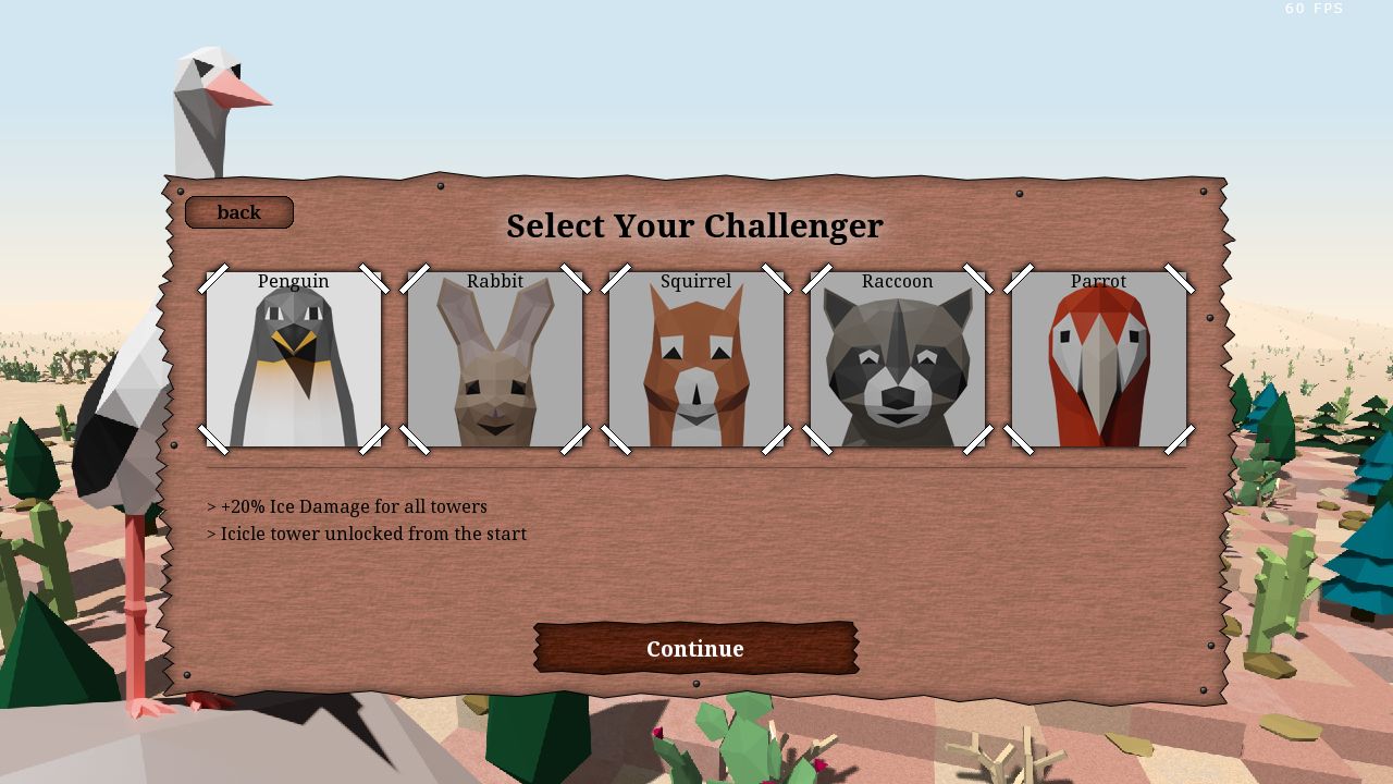
Challenger selection interface
Selecting a challenger is an important decision for the game. Therefore I wanted to have a big and good looking UI rather than just a simple dropdown. I had the idea of creating portrait images of the animals to be used on the selection buttons. Some of the items and icons in the game are using a pixel art style. The portraits are quite big, so the pixel art images would either need to be fairly large or very blocky, and neither would match the style of the game. Instead, I went with the Blender route and created low poly models of the animals. To save some time I only modeled the face and upper body, which are the only parts visible in the render. Like film sets, they don't have any backsides. A few of the animals turned out a bit weird and I may redo some of them, but overall I am very happy with the style of the portraits.
The buttons are toggle buttons. This means the selected challenger can be highlighted with the texture of the button. My toggle buttons have four states: normal, hovered, toggled, toggled&hovered. In its normal state, the background is grey and the animal has a grey overlay. When toggled on the animal is shown in full bright color and the button background is almost white. This way it is clear which challenger is currently selected. Selecting a challenger also changes the description at the bottom so the players can make an informed decision about which challenger they would like to play as. The multiplayer lobby of the game looks and works a bit different than starting a singleplayer game. But I still wanted to use the nice challenger selection UI and luckily it only needed a few modifications to be compatible with the multiplayer lobby too.

Refactoring the blueprint system
When I drew up the plan for the challengers on a piece of paper I also thought about how to implement the challenger effects. In addition to more generic effects like +10% attack speed, I also wanted some challengers to have different towers unlocked from the start. The game uses a blueprint system for the towers. Previously there was one list with all the blueprints in the game, which was mostly fine and I could have found a way to make the challengers work with it. But the more I thought about it it became clear that there was a better way to handle the blueprints. The game still loads all blueprints from their data files when the game is started. But rather than storing a single list, every player now gets a copy of all blueprints. While this requires more memory and more logic, this has a few advantages. First of all, it is very easy to mark different blueprints as unlocked for different players depending on their challenger.
Secondly, having one copy per player opens up the option to show on-hit effects or other tower effects in the hover window that appears when moving the mouse over a build button. Let's say there is an item that adds a poison on-hit effect to all towers and one player picks up the item. When there was only one list of blueprints that effect could not be added to the blueprints, because it would have affected the towers of all players. The building hover is based on the blueprint of the tower, therefore it didn't show the poison effect. When the player built a tower the poison effect was applied correctly, but the player would need to keep in mind that he picked up the item rather than seeing it directly in the building hover. Now, with a blueprint copy for every player, the poison effect can be added to the blueprints of that player, which means they show up in the building hover.
It took some time to change the blueprint system this late in the development. Because it is such an essential system, there are a lot of other features that build on it and I had to make sure that all of them still worked correctly after the change. But the new system is a lot more flexible and it was worth the effort of changing it.
The challenger system is a simple concept, but it has a big effect on the gameplay. Having different towers unlocked from the start and global effects for all towers changes how the players approach the game. There are many opportunities during the game to unlock additional towers and items and depending on the effects of the challenger the value of these items changes. A bad item may become more valuable if it synergizes with the effect, while a good item may be less desirable if it doesn't. It was quite a bit of work to add the challengers and change the blueprint system, but I am very happy that I did it. I believe it will make the game a lot more enjoyable.
by Christian - 07.06.2020 - 20:46
 pingpoli.de


