GameDev Blogpost 46: More Item Types
Active, Consumable and Equipment Items
08.03.2020 - 09:36For a long time I have been contemplating whether I want to add more item types into the initial release of the game or add them in a later update. This week I have decided to implement them right now to give the items a bit more variety.
Active Items
The first new item type I worked on was active items. As the name suggests, active items are items that the player can use multiple times over the duration of a game. Active items have a wave cooldown, which means they can be used every 2 waves, 3 waves, etc.
Adding new item types required a few changes to the way items were handled in the game code. All different item types inherit from the main item class and specialize depending on their use case. The active item has a onUse callback function that specifies what happens when the player uses the item. For simpler items all that has to be done is to create the onUse function, while more complicated items can inherit from the active item class and implement more advanced effects. I also had to change how items are given to a player. Previously every player only had a list with item references. However, the new item types need to keep track of internal stats, like a cooldown for example. Therefore every player needs a new copy of the item.
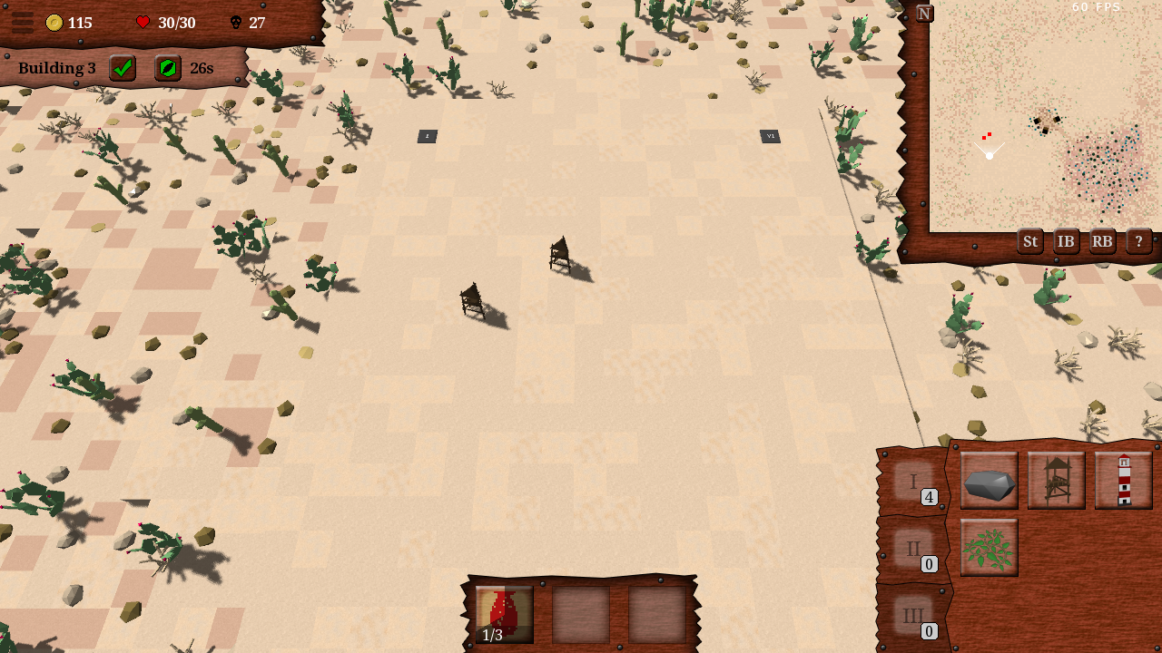
The real work however was to figure out how I wanted the UI to handle active items. At first I added them to a new list in the item browser, but I quickly realized that this wasn't really convenient to access. Instead I created a new active item UI that shows up at the bottom of the screen once the player picks up an active item. There are 3 active item slots and the items can be used by left clicking them. They also show their cooldown with the timer label I have created for debuffs a while ago and extra text on top. Finally I had to change how the items themselves are rendered. Previously every item had its background already in its texture. But this doesn't work for active items, because they need to have a button underneath that has a hover effect. I could have created special button textures for every active item, but that seemed like a lot of unnecessary work, so instead I only made the button textures and saved the items with transparent backgrounds and rendered them on top of the buttons.

Consumable Items
When I had active items in the game the next logical step were consumable items, which are basically active items that can only be used once. Because they are so similar consumable items were fairly straight forward to implement, the only thing that required a bit more thinking was removing them once they were used. On the UI side however, it felt a bit weird adding the consumable items to the active item ui, because there are only 3 active item slots and you wouldn't want to block them with consumable items. To give consumable items a place and also in preparation for the equipment items I made a new inventory window. Compared to the old item browser UI the new window is a lot smaller and can be moved, so it uses a lot less screen real estate and can be kept open if the player wants to.
Equipment Items
The third and final new item type I added were equipment items. Equipment items go into the inventory when picked and some towers have special equipment slots where the items can be equipped and then grant benefits to the tower. They were a bit more tricky to implement and took some time. And I am not completely done with them yet. The functionality is complete and working, except for making sure that they work in multiplayer games. But the UI needs more work. I don't know how I want the building window to show equipment slots and equipped items. Do I want to increase the size of the building window and if the building doesn't have equipment slots that area just stays empty like it is right now with upgrades, or do I want to add some kind of extension to the bottom of the window that is only visible when the tower has equipment slots, or maybe have a different window texture for buildings with equipment slots? None of the solutions seems optimal at the moment and I'll have to think about it a bit more.
Misc
- The reward selection ui will now indicate what type of item each option is.
- For some reason I had the initial selection and the reward selection ui as seperate classes even though they are almost identical. Now I combined them into one, which makes for cleaner code and that is always nice.
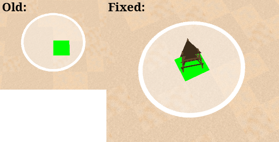
- When building a tower, a preview tower model is now rendered while placing the tower in addition to the range indicator and the red/green valid location quad.
- Fixed a bug that the center of the range indicator while building was at the corner of the tile instead of its center.
- Reduced the hover delay of the building hover to 0.

by Christian - 08.03.2020 - 09:36
 pingpoli.de


