I Created a 3D Portfolio Website with WebGL
Developing and Using a Custom WebGL Engine to Build a Portfolio Website
23.08.2024 - 13:22I've been working as a freelance web developer for the last few years. It went well during the pandemic, but I haven't had as many projects recently. I’m looking for more freelancing opportunities or another job, so I need a portfolio website.
A common theme in my freelancing endeavors was WebGL, which inspired me to develop a 3D portfolio website with it. To make it more fun, I decided to use my Sparrow WebGL engine and improve its 3D features while working on the website.
Features
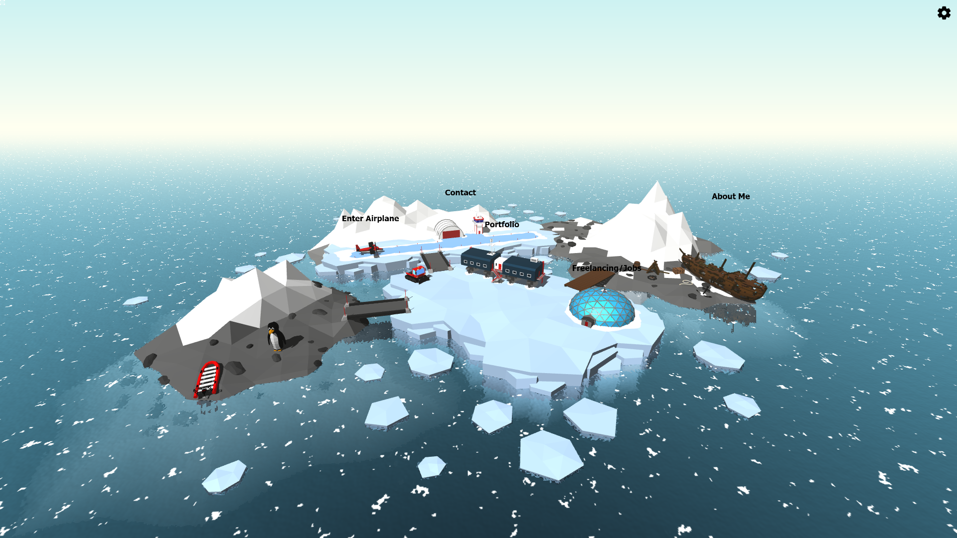
The basic concept is an Antarctic environment with interactable elements. These elements have labels above them and show an outline when hovered. In the simplest case, clicking on them opens an HTML window like the Portfolio or Freelancing sections. Some of the elements, however, have special behaviors.
The About Me section is a model of a shipwreck. When clicked, an animation starts: The camera moves closer, some building particles and sound effects play, and the model is replaced with a repaired ship. Also, a small popup with a typewriter effect appears that says "Hold on a second, let me clean up a bit...". Originally, it was "Welcome to the shipwreck that is my life. Oh wait, I wasn't supposed to say this publicly. One second please...", but I got some feedback that some people might not appreciate this type of humor.
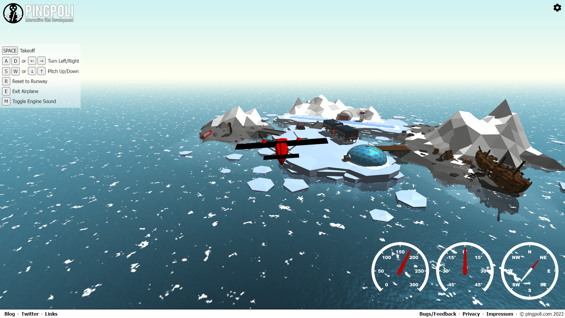
The next special element is the airplane, which is actually flyable. Clicking on it places you on the runway and the controls and basic flight instruments appear. The flying itself is intentionally kept very simple, I didn't want to implement a whole flight simulator. You can only control the yaw and pitch of the plane, but the roll is linked to the yaw to fly banked turns. Airspeed is proportional to the altitude and if you fly too high, the plane can stall. The takeoff is performed by an autopilot because I didn't want to add collision detection, which also means you can fly through everything except for the water and you cannot land on the runway again.
The penguin is special too. The name pingpoli was the name of a plush penguin I got as a child, which I later used for my domain and inspired the Antarctic theme. The penguin can walk on the flat parts of the terrain. Originally, I wanted to link the site navigation to the penguin, i.e. you can only interact with elements that are nearby. However, this turned out to be too cumbersome and not intuitive enough for all users. Instead, you can always click on the elements, but the controllable penguin remained. It also comes with two debug options: You can turn on a nav mesh and path-finding overlay in the website options.
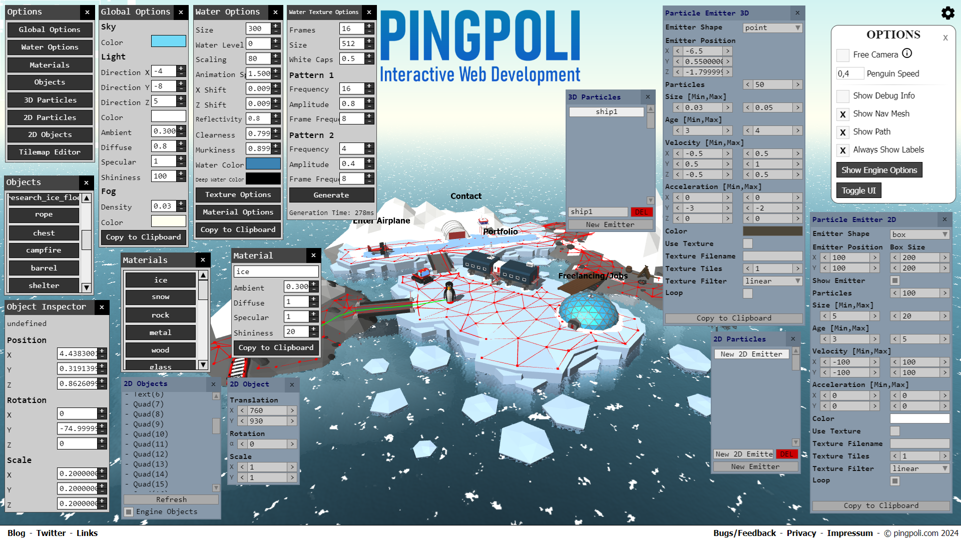
Finally, the website has the engine options enabled and you can toggle them in the options menu at the top right. This is something that an average visitor probably wouldn't care about, but for nerds like me who like to see behind the scenes, this is very interesting. This is also one of the benefits of using a custom WebGL engine. You can change many options in real-time including sky color, light direction and color, fog settings, all water settings with the procedurally created water texture, material settings, and even spawn and play with custom particle systems. You can change the look of the website completely if you want to.
Almost all possible engine options expanded:
Why a Custom WebGL Engine?
I use Babylon.js for freelancing projects and I've tried Three.js in the past too. I could have easily used an existing framework and the final website would have looked very similar.
However, I also love creating graphics engines from scratch. When I first used WebGL for my bachelor's thesis, I didn't use any frameworks. I also learned OpenGL to create my own C++/OpenGL engine and tried DirectX and Vulkan too. It's a lot more satisfying when you build everything yourself rather than using an existing framework or engine. You also know how everything works and how to fix the inevitable bugs.
Developing a custom WebGL engine for a single website would have been a bit audacious - even for me. I had already started to work on the engine when I got the idea for the website. With my indie game project and its OpenGL engine on hold due to low chances for commercial success, I wanted to switch to WebGL for casual game development. Since lower-level graphics programming is fun for me, I don't like to use existing engines for game development, but I don't want to spend too much time on annoying tasks either.
Creating a custom WebGL engine and using it for game development is a great middle-ground in my opinion: It's cross-platform, runs in the browser, you don't have to worry about Unicode support, you can combine it with normal HTML elements, and you can even create standalone programs and apps with tools like Electron or Capacitor. The types of games I want to work on don't require cutting-edge performance from something like C++ with OpenGL or Vulkan, but might even benefit from being playable in the browser.
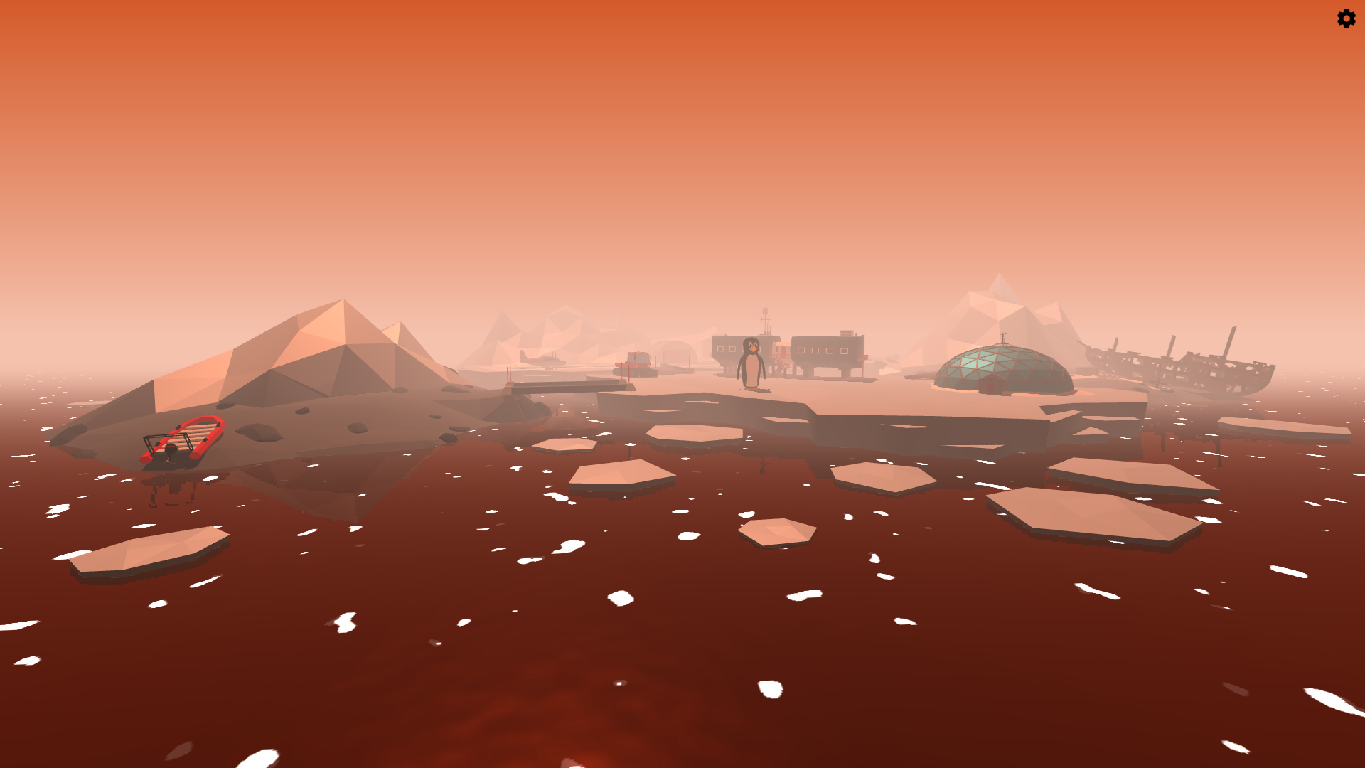
You can change a lot of options in real-time to create a completely different look:
Art
I chose a low poly style for several reasons. A photorealistic look is much more difficult to achieve if you don’t want to spend a lot of money on models. Like programming, I prefer to model as much as I can myself. While I’m certainly not as good as some professionals, I’m reasonably confident in Blender and can create at least decent-looking models, especially in a low poly style.
Low poly models also come with a number of benefits, especially for WebGL, where file size is very important: This one might be obvious, but by definition, low poly models use less polygons than high poly models and fewer polygons mean smaller files.
The biggest benefit, however, is using vertex colors instead of textures. If you look at photorealistic models, the biggest factor impacting file size is textures. Typically, you have at least two textures per model: a color texture and a normal map, possibly even more depending on your shaders. Since most textures have to be high-resolution to prevent too much blurriness and two or more textures per model with easily a few dozen models per scene, this adds up very quickly (this is also a big part of the reason why the disk space requirements of modern games have exploded in the past few years). Vertex-colored and flat-shaded models don't need any textures and normal maps, so the files remain small and perfect for WebGL applications.
Overall, I'm mostly happy with the models and the scene, but there are always things you can improve. I think, most of the models like the airplane, the snowplow, or the research station turned out very well. The mountains and some of the terrain, however, might be a bit too simplistic compared to the level of detail of some of the other models. In other environments, you can add plants and rocks to add more detail and clutter, but snow-covered mountains and ice sheets don't have any defining features, so they feel a bit empty. I would also like to add more life to the scene like whales in the water and some birds flying around, but that might come in the future.
The Antarctic environment:
Text
By far the most difficult aspect of creating the website was writing the text. When it comes down to it, the whole point of a portfolio website is marketing and I have no idea how to advertise anything, especially not myself.
How do you write an about me section that's short and precise, but at the same time truthful and personal, maybe even a bit witty? I have no idea. Everything I tried to write sounded either extremely cringe or was lengthy and rambling.
Writing the portfolio sections wasn't that much better either. How do you summarize long and complicated projects in a few paragraphs? For example, I worked mostly full-time on an indie game for over a year and wrote more than 50 blog posts about the development process. It involved my custom C++/OpenGL engine and its UI library, networking, a custom map editor, the game itself, and many other helper libraries and tools. There's just no way to mention all of this in a short portfolio text.
There is also no feedback on whether a text is good or not compared to programming where there's always the fundamental benchmark of "Does it work?". I asked a few people for feedback and got some good tips, but friends will always judge things differently than a complete stranger who is considering hiring you.
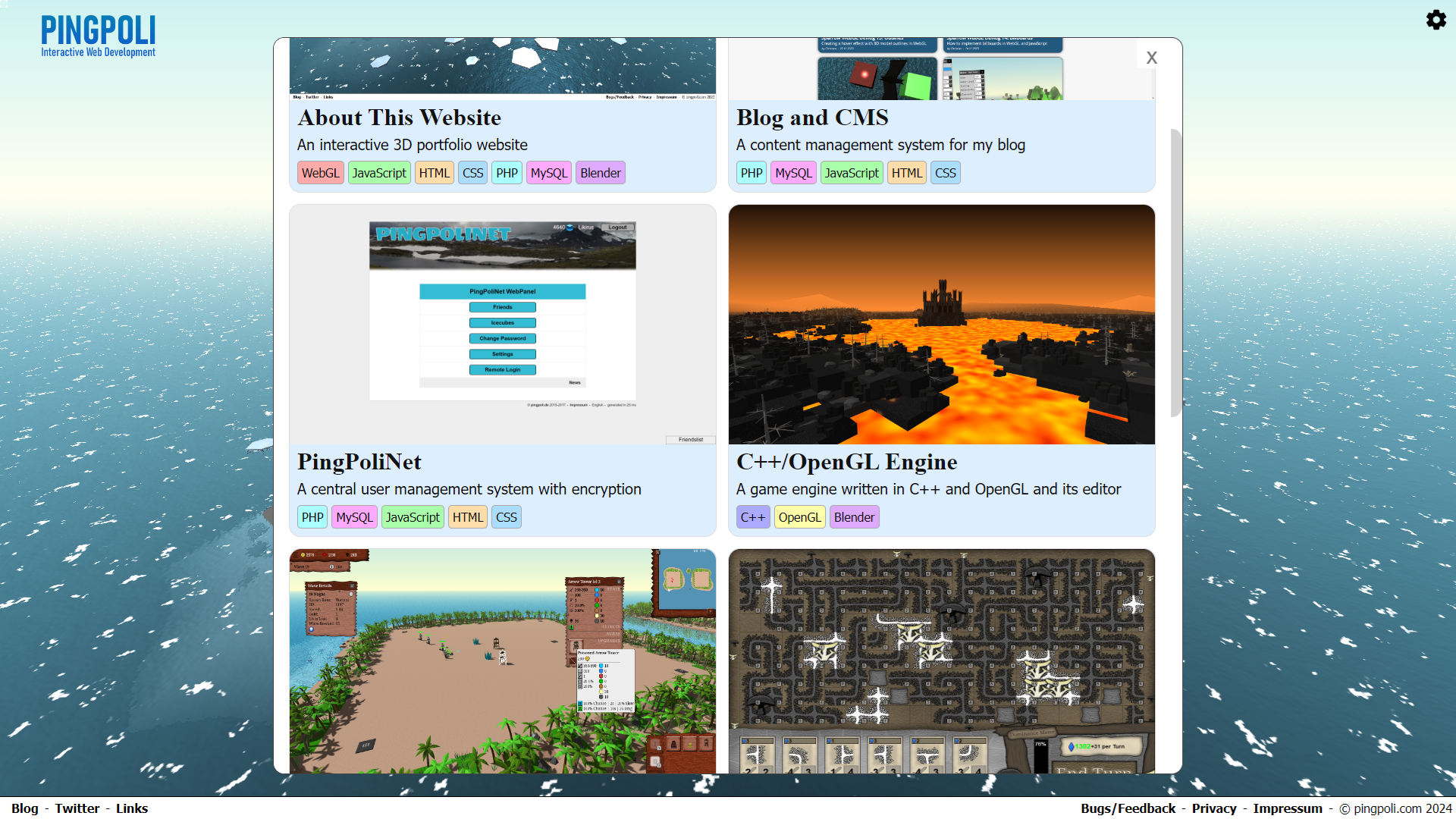
The portfolio section of the website:
Was it worth it?
Honestly, I don't know if it was worth it creating the website. I was excited about the idea and working on the WebGL features was a lot of fun. However, towards the end of the project when I had to write all of the text, I struggled a lot. Navigating the nuances of marketing and polishing every last detail isn't really my strength and sadly, success depends more on this than programming skill.
Objectively, the most impressive aspect of the website is the custom WebGL engine. However, you cannot really see that. If you render the same models with Babylon.js or Three.js, the result would look very similar. After getting some feedback about this, I added a badge on the home page that mentions it, but most people won't understand the differences anyway.
While the 3D environment is pretty cool, the design of the normal website elements isn't anything special. Web design is fun and I like it, but I won't win any awards. Is an average design good enough to leave a meaningful impression? I don't know.
Worst of all are the texts. As mentioned above, I have no idea how to write these marketing texts. Whatever I tried to write sounded cringe and fake, and asking ChatGPT wasn't much better either (I ended up writing everything myself).
The website isn't optimized for mobile yet either. WebGL runs on phones too, but a 3D concept like this doesn't really work on small mobile devices. If somebody just visits the website on their phone, that's going to leave a bad impression.
You can fly the plane:
Overall, I’m happy with the website. I like the concept and some parts turned out really well, but other parts could be improved. I feel like it’s almost there, but it’s missing some small additions and changes that could push it over the edge, I just don’t know what those would be. In the end, the goal of the website is to find more freelancing opportunities or a job, so I guess we’ll see if it can help me do that.
Check out my new portfolio website: https://pingpoli.com
by Christian - 23.08.2024 - 13:22
 pingpoli.de


